
Flexbox, or the Flexible Box Layout, is a CSS layout model designed to handle complex layouts and alignments in a more efficient way than traditional methods. It provides a flexible and responsive way to arrange items within a container
justify-content
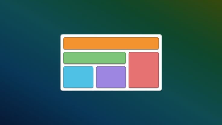
The justify-content property in CSS is used to align and distribute space between and around items along the main axis of a flex container. It helps control how items are spaced out when there is extra space in the flex container.
// source code
align-items
The justify-content property in CSS is used to align and distribute space between and around items along the main axis of a flex container. It helps control how items are spaced out when there is extra space in the flex container.
// source code
align-content
The justify-content property in CSS is used to align and distribute space between and around items along the main axis of a flex container. It helps control how items are spaced out when there is extra space in the flex container.
// source code
flex-direction
The justify-content property in CSS is used to align and distribute space between and around items along the main axis of a flex container. It helps control how items are spaced out when there is extra space in the flex container.
// source code
flex-wrap
The justify-content property in CSS is used to align and distribute space between and around items along the main axis of a flex container. It helps control how items are spaced out when there is extra space in the flex container.
// source code
gap
The justify-content property in CSS is used to align and distribute space between and around items along the main axis of a flex container. It helps control how items are spaced out when there is extra space in the flex container.
// source code
align-self
The justify-content property in CSS is used to align and distribute space between and around items along the main axis of a flex container. It helps control how items are spaced out when there is extra space in the flex container.
// source code
use flex box
flex-wrap:
flex-direction:
justify-content:
align-items:
gap:
10px1
2
3
4
if we use
(row)
if we use (column)